
- Key Takeaways
- The Silent Salesperson Problem
- Why Your Website Fails Lead Generation
- The Psychology of a “Yes”
- Leverage psychological triggers such as social proof, scarcity, and authority to influence buying decisions and lead behaviors.
- Build trust by addressing pain points and offering solutions tailored to your ideal customer experiences.
- Use persuasive copywriting and visual storytelling to create an emotional connection with your audience.
- Guide visitors through a logical progression that reduces friction and increases the likelihood of conversion.
- Architecting a Lead Generation System
- Advanced Conversion Strategies
- Measuring True Performance
- Conclusion
- Frequently Asked Questions
- How can I turn my website into a consistent lead generation machine?
- Why is my website getting traffic but no leads?
- What is the “silent salesperson” problem?
- How does psychology improve website lead generation?
- What are some advanced website conversion strategies?
- How do I measure if my lead generation is really working?
- How do I architect an effective lead generation system?
Key Takeaways
- Think of your website as a lead generation machine, not a silent salesman, with clear copy, easy navigation, and obvious calls to action that direct people where to go next. With every page serving a purpose, you produce more consistent, predictable opportunities to capture qualified leads.
- Plug typical lead gen leaks by matching your content to your ICP, streamlining flows, and going mobile! Regularly analyze to identify where visitors drop off and optimize your messaging, layouts, and forms to minimize friction.
- Gain trust by featuring testimonials, case studies, certifications, and transparent company information so visitors are comfortable providing their information. Put all the usual concerns and data privacy information upfront to eliminate hesitation and enable higher conversions.
- Upgrade your value proposition and user flow. Explicitly state the results you provide and support it around forms and CTAs. Map out every step of the visitor’s journey, eliminate what you can, and leverage analytics to continually optimize that path.
- Go deep with personalization, interactive tools, and behavioral triggers. Segment audiences, customize offers, and automate timely follow-ups so you can nurture leads more efficiently and target sales efforts on the most qualified prospects.
- Always measure performance with transparent metrics such as conversion rate, lead quality, and cost per lead. Then, experiment with improvements through A/B experiments. This continuous optimization allows you to evolve with buyer behavior and constantly increase ROI from your site.
Website lead generation is the process of converting your site visitors into leads by capturing their contact information and intent. In practice, this translates to leveraging forms, calls to action, landing pages, and even simple tools like chat widgets or pop-ups to capture interest at the right moment. Robust lead generation follows where they come from, where they click, and which offers cause them to hand over their email or phone number. Most teams connect these leads to a CRM or email tool so they can follow up in an organized and consistent manner. To find out what converts best, they A/B test headlines, layouts, and offers. The following sub-sections walk you through each step with clear, actionable examples.
The Silent Salesperson Problem

For the most part, websites are like silent salespeople who never initiate an actual conversation. They lurk in the shadows, flash a few statistics, and then expect visitors to just figure it out. In a cluttered digital environment, that void is where prospects fall through.
A site’s got like 8 seconds to grab a little attention. They make a first opinion in a blink, from design to layout to how intuitive it seems to navigate. If it loads slow, looks cluttered or the menu seems confusing, visitors flee before they ever see your deal. For each additional second of load time, a site can lose approximately 7 percent of conversions. This damages crucial marketing metrics such as traffic-to-lead ratio, landing page sign-ups, and even search rankings since disgruntled users bounce quickly.
A quiet site doesn’t direct visitors to obvious next actions. If users have to click more than a couple of times to get what they want, lots of them bail. Studies say that 37% of users leave after one bad run with site navigation. That could be a pricing page tucked away in a drop-down, a contact form lost in the footer, or a critical service explained only in a lengthy blog post. In all of them, interest is present but the course of action is not.
A better site isn’t a brochure. It’s a silent salesperson who really listens. It begins with an obvious, straightforward value proposition, positioned prominently on the page, that communicates who you help, what you do, and why it benefits them. Then it supports this with useful, low-pressure CTAs. Forward-thinking CTAs such as ‘Learn more’, ‘Get a free sample’ or ‘Schedule a 10-minute call’ provide visitors secure increments rather than shoving ‘Buy now’ down their throat immediately. This type of path allows users to progress through the sales funnel at a speed that matches their trust level and stage. It still benefits your business objectives.
Why Your Website Fails Lead Generation
Most websites suck at leads because they lack fundamental conversion elements. Approximately 85% of sites do not have obvious messaging, frictionless paths, or compelling reasons to believe or act. Common issues include:
- Vague or confusing value proposition
- Poor or cluttered layout and user flow
- Hard-to-find forms, contact options, or phone numbers
- Weak or hidden calls-to-action
- Slow pages and complex design features
- No clear proof that the business is credible
- No focus on mobile users
- Little to no use of analytics to guide changes
When these gaps add up, visitors conclude in seconds that the site cannot assist them and the opportunity to capture a lead is lost.
1. Disconnected Messaging
If people can’t figure out what you do and why it’s better in 5 seconds, they leave. That means your hero section needs to address a specific problem and result your ideal customer profile cares about in simple language, not nebulous assertions. ‘End-to-end solutions’ or ‘world-class services’ tells me nothing. ‘Cut your fleet fuel cost by 20% with real-time tracking’ speaks to a specific pain.
Think of the core message as your key to identify defined buyer personas and their language. A B2B software purchaser anticipates different copy than a neighborhood gym rat. Make sure your headlines, subheadings, and short benefit bullets all reinforce the same promise on your homepage, landing pages, and content. If the ads say one thing but the page says another, leads plummet.
Speak to clear, tangible advantages — don’t spew out a features list. Demonstrate how your offer saves time, cuts costs, reduces risk, or makes better results, and make that connection explicit. Tie every important content back to your lead process, be it a demo request, quote form, or email sign-up.
2. Invisible Pathways
Most sites obscure the journey from initial visit to inquiry. Menus are packed, pages go in circles, and forms lurk multiple clicks down. Visitors should never wonder at a moment’s glance what to do next.
Map one main path for each persona: home → key problem page → proof → call-to-action. Utilize straightforward menus, eliminate redundant links, and direct ad traffic to targeted landing pages, not to generic homepages.
Put forms, ‘Book a call’ or ‘Get pricing’ buttons near the top and again after key sections. Add visual cues, such as arrows, contrast colors, and whitespace, so eyes land on the next step, not sliders, pop-ups, or auto-play videos that add delay and noise. Even a one-second load delay can impact conversions in a tangible manner.
3. Broken Trust
Visitors decide whether you’re credible within seconds. If your design looks old, fonts are difficult, or pages stutter and load slowly, people don’t want to share data or money. Too many animations or moving sliders feel good to you but often scream danger and bog the page down.
Trust builds when you demonstrate actual evidence. Transparent, named, and role-specific client testimonials, brief case studies with numbers attached, and recognizable client logos increase conversions by 200 to 300 percent. Put them near CTAs, not on a lonely ‘Testimonials’ page. Demonstrate impact such as “Shortened onboarding from 10 days to 3” not “Client was very pleased.
Data privacy is trust. Implement clear privacy notices and cookie consent, and where applicable, GDPR-compliant forms explaining usage of information. Add trust badges from payment providers or security tools. Address frequently asked questions regarding price ranges, timelines, or support early on so visitors don’t think you’re concealing critical information.
4. Weak Invitations
Calls-to-action often suck because they’re too vague or low value. ‘Submit’ under a long form provides no incentive to take action. Instead, spell out the gain: “Get my free 10-page SEO audit” or “Book a 15-minute product tour.” Match the ask with the visitor’s stage: webinars, guides, or checklists for early research, and demos or quotes for buyers closer to a decision.
CTAs should appear in more than one place: in the header, in page sections, and at logical breakpoints in content. Some are hot to go right now, some need to be convinced by reading the testimonials. If your contact form is buried in the footer or only on one page, many leads never even bother to look for it.
A/B test different words, colors, and button sizes and observe data rather than speculation. Easy fixes such as swapping out ‘Contact us’ for ‘Talk to an expert today’ can drive conversion. Layer in incentives, such as trials, short consultations, and access to exclusive content, so the next step feels helpful, not risky.
5. Mobile Neglect
Since over 70% of users browse sites on mobile, a desktop-first layout shuts a big portion of your lead funnel. If pages don’t fit the screen, fonts are minuscule, or buttons crowd too close, they bail before they ever see your offer. A sluggish page on a mobile network does even more damage, and each additional second reduces conversion probability.
Use responsive layouts that load fast on small screens, compress your images, ditch the heavy scripts and unnecessary sliders. Make mobile navigation concise and obvious. Make CTAs large enough to tap with a thumb and keep critical actions above the fold.
Forms need special attention on mobile devices. Trim them down to the bare minimum fields you really need, label them clearly, and provide options such as ‘Continue with email’ rather than long multi-step fields.
Monitor mobile analytics for bounce, time on page, and form abandonment. If mobile visitors land but don’t submit, that’s a clear indication your mobile flow is blocking them, not your offer.
The Psychology of a “Yes”
On a site, a yes is never accidental. It stems from a combination of how people feel, what they perceive as risk, and how well your offer aligns with their objectives at that moment.
Leverage psychological triggers such as social proof, scarcity, and authority to influence buying decisions and lead behaviors.
Social proof demonstrates to visitors that they’re not the first. Reviews, case studies, download counts, and “Trusted by 2,000+ customers” signals eliminate uncertainty. If a visitor sees that others in their role or industry already joined, the subsequent “yes” seems more secure. This counts for lead forms, trial sign-ups, and demo requests.
Scarcity makes them act now, not later. Deadline-driven offers, such as “Closes in 24 hours,” limited capacity, such as “20 seats per live training,” or bonus quantity caps all provide a very specific urgency to get off the fence and act right now. That should be real, not fake timers or impossible to verify vague claims, or you erode trust.
Authority is useful when people are afraid to make a bad choice. Expert quotes, certifications, research links, or a bold display of years in business all lower the perceived risk. Small things like “Backed by independent lab tests” or “Used by hospitals in 15 plus countries” can nudge a reluctant user to complete your contact form.
Build trust by addressing pain points and offering solutions tailored to your ideal customer experiences.
Trust builds when you demonstrate you get the actual issue, not just your item. This means plain language about pain points: lost time, low margins, manual work, compliance stress. When a visitor scans a headline such as “Cut monthly reporting from 10 hours to 30 minutes,” they are seen.
Rapport increases the likelihood of a “yes.” They say yes more when they feel comfortable and have found commonality. Transparent “who is it for / who is it not for” sections, candid price brackets, and straightforward FAQs reduce stress. When your content aligns with the visitor’s role, industry, or scale, such as different routes for small teams and large organizations, they believe you crafted the experience for them, not a generic “user.
Reciprocity layers on top of that. When you provide genuine worth ahead of the ask, people tend to experience a subtle shove to reciprocate. Psychologist Phillip Kunz demonstrated this with holiday cards sent to strangers, who responded at a rate of approximately 97%. On a site, this can be deep guides, free tools, or audits. If a visitor gains transparent understanding from a free calculator or checklist, swapping an email for more seems like an equitable transaction, not an expense.
Use persuasive copywriting and visual storytelling to create an emotional connection with your audience.
Words and images define how a request feels. The same form can appear to be a danger or a comfort. Power pages connect the offer to objectives and values, not just characteristics. If your audience cares about career growth, the copy could emphasize “Become the go-to person on your team,” not just “Gain access to our resource hub.
It’s all about framing. Requests that emphasize benefits and positive gains get more “yes” responses than those that emphasize loss alone. Specific, pointed phrases like “Get a step-by-step plan to cut support tickets” paint a crisp image of benefit. Don’t use sloganeering; specify a concrete change the lead will experience.
Emotion too. They will act when they feel a connection between their narrative and yours. Customer tales with before and after states, brief quotes with photos, or a one minute video of a real user strolling through their problem render the next step human, not conceptual. It’s not theater they want, but the quiet confidence of folks like me figured this out.
Guide visitors through a logical progression that reduces friction and increases the likelihood of conversion.
A yes frequently begins with a significantly more minor move. Commitment and consistency stand for the idea that once people make a small, low-risk decision, they will be more likely to comply with the next related request. On a site, this might be a progression from a quick read to sampling a widget to signing up for a newsletter and then requesting a demo. Each step seems like a logical extension of the previous one.
This reasoning ought to appear in page layout. First, assist visitors in identifying their problem. Next, demonstrate that there is a clear path to change. Then offer the least demanding next step. Do not request a 20-field form when someone is still at the ‘just curious’ phase. Fewer form fields, obvious privacy notes, and opt-in extras decrease friction.
Requests that align with values and goals resonate better. They say yes more when a call-to-action suits their role, hits their targets, and resonates with their identity. For instance, a team-oriented manager may respond better to “Get a plan to help your team hit targets” than “Download our brochure.” The real offer is data capture, but the frame is aligned with what they care about.
Social proof can strengthen every point along this journey. Little reminders like “5,000+ people subscribed this month” near a sign-up box or “Teams in 30+ countries use this template” beside a download help visitors imagine their decision is typical and secure.
Scarcity can bolster timing in this flow. Limited-time bonuses for new subscribers or a handful of free consultations per month get people who are already leaning yes to act sooner. Used judiciously, this trims procrastination without spilling into coercion.
Architecting a Lead Generation System
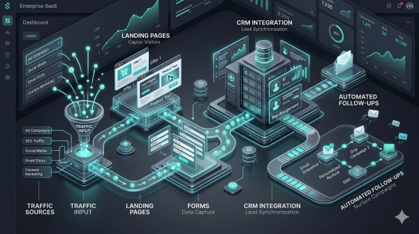
About: Designing a Lead Generator At minimum, it should run on a clear chain: capture, qualification, routing, follow-up, with one dominant action, such as booking a call, requesting a quote, downloading a guide, or sending an inquiry. Each design decision, form, and copy should feed that conversion funnel on desktop and mobile, with quick-loading pages, easy stages, and adaptive design, as mobile users bail fast when interaction seems sluggish or cumbersome.
The Value Proposition
A compelling value prop grounds this system and provides leads a reason to take action. It should address qualified visitors who already feel the problem and desire a concrete solution, not abstract assurances. Basic headlines perform and are supported by one or two brief lines that quantify the outcome like “Reduce payroll mistakes by 30% in 90 days” or “Deliver within 24 hours with live inventory tracking.
Key elements to include:
- Who it is for (ideal customer profile)
- Core problem or risk you solve
- Tangible outcome (time saved, cost reduced, revenue gained)
- Timeframe or conditions for that outcome
- What makes your approach different or safer
- Proof elements nearby (metrics, logos, certifications)
Position this value message close to your primary CTA, within forms, and once again on thank-you pages. This way, visitors are constantly reminded why it’s worth sharing their data or booking a call.
The User Journey
The user journey begins with an initial touch (search, ad, referral or social), through education (blogs, guides, product pages), then into capture, qualification and onboarding. Each step should support a clear task: understand the offer, decide if it fits, then take that one dominant action.
Important touch points are typically landing pages, comparison pages, pricing or “plans” views, calculators and FAQ. At each point, match content depth to the visitor’s awareness: lighter content early, more precise details and proof closer to forms and booking flows.
Friction appears in long forms, ambiguous next steps, and slow load times, particularly on mobile. Restricting forms to required fields tends to boost sign-ups. Non-essential questions shift to a subsequent step or an email sequence after commitment has been established. Setting qualification rules first and then designing forms second helps determine what fields actually count.
Analytics should track scroll, click paths, and drop-off points per device. Use that data to rearrange page order, tighten copy, or shorten steps where users hang up, and test again until your conversion and completion rates shift in the right direction.
The Trust Framework
Trust underpins every phase of capture, qualification, routing, and follow-up. Visitors verify if you’re authentic, trustworthy, and going to perform as promised in seconds.
| Trust signal type | Example elements | Impact on perception |
|---|---|---|
| Social proof | Reviews, ratings, client logos | Lowers perceived risk and “too good to be true” fear |
| Evidence of results | Case studies, metrics, before/after data | Shows outcomes are repeatable, not one-time events |
| Organizational clarity | Address, team page, registration details | Signals legitimacy and accountability |
| Third-party validation | Media mentions, certifications, awards | Adds external credibility beyond your own claims |
| Security and compliance | SSL, policy pages, data handling statements | Eases concerns about sharing contact information |
Detailed case studies that show the starting point, what you did, and demonstrable impact, such as “lead-to-deal time cut from 14 days to 5,” help buyers visualize how your process actually works in practice. Transparent contact choices, including a street address, direct email, or phone, make it simple to check who’s running the site.
On the system side, the site needs to hook cleanly into a CRM or data store, so new leads sync in seconds. Internal alerts and auto-response emails should fire nearly immediately because conversion friction increases rapidly with delay, and a lead that is not routed and contacted within minutes quickly loses conversion likelihood. Third-party reviews, independent ratings and any neutral media coverage close the loop, providing tentative buyers with another tier of comfort before they fill out a form or schedule time.
Advanced Conversion Strategies
Advanced conversion work uses data, automation, and behavior signals to convert more visitors into qualified leads without introducing friction or guesswork.
Hyper-Personalization
Hyper-personalization begins with clean data. Capture simple behavior such as pages visited, time on page, scroll depth, downloads and correlate that to ICP characteristics like industry, company size or role. AI tools can cluster visitors with similar behavior and recommend content, offers or layout adjustments tailored to each cluster, frequently boosting engagement without a redesign.
Leverage this knowledge to customize headlines, proof points, and calls to action by intent. They’re a visitor who browses pricing and case studies. They need risk reduction, so show ROI stats, social proof, and a “Talk to sales” CTA. A new visitor on a tutorial blog might convert better to a brief guide, checklist, or minimalistic “Get weekly tips” form. Requesting too much information too early, like budget and phone number on the initial form, typically decimates conversion rates. Begin with email and one to two simple qualifiers, then request more information as trust builds.
Email and retargeting should follow this logic. Segment by role, problem, or stage rather than blast one big newsletter. For instance, one series for buyers comparing vendors, another for feature-loving users, and yet another for partners. Retargeting ads can display case studies to late stage visitors or just plain “finish signing up” nudges to form abandoners. Personalization at this level works because it modifies timing and relevance, not volume.
Marketing automation brings it back together. Create rules that trigger sending your next-best asset when they visit an important page, and pause or change messaging if they stop opening emails. Track outcomes, not vanity metrics: lead-to-meeting rate, pipeline created, and revenue by segment. Small, targeted tweaks in these flows can move the needle overnight.
Interactive Elements
Interactive elements turn passive visitors into active participants. Quizzes, calculators, and short assessments help people see their own numbers or gaps, which gives them a clear reason to share contact details. A savings calculator, a maturity score, or a simple benchmark report can all work if the output is useful on its own and not just a sales pitch.
Real-time tools add an additional level. Live chat, chatbots, or AI voice agents can greet visitors on high-intent pages, address simple queries, and pre-qualify leads according to a handful of attributes such as location, team size, and use case. Proactive chat triggers, for example, opening a message when someone lingers on pricing for 40 seconds, catch people in the instant they’re second guessing and frequently rescue the lead. When they sync with your CRM, new contacts and conversation notes flow directly into the same system your sales team already uses, making follow-up quicker and more seamless.
Leverage webinars, polls, and quick surveys to continue to engage and drive it deeper over time. Short feedback prompts after a blog article or a product page provide both insight and a natural opportunity to invite readers into a mailing list or live session. Keep forms short. One or two required fields frequently outperform long forms even when the content is strong.
Gamified touches can assist. Progress bars on multi-step forms, tiny prizes for completing a quiz, or tiered “badges” for educational journeys motivate users to actually finish tasks they initiated. Clear value, not gimmicks, is the key or visitors will flap out.
Behavioral Triggers
Behavioral triggers leverage what visitors are actually doing, not what you believe they should be doing. Create rules that trigger when a visitor hits high-intent pages, visits pricing multiple times, or downloads specific files. Then send targeted follow-ups like a relevant case study, comparison guide, or quick invite to a live demo. This keeps outreach helpful, not hard sell.
Exit-intent popups and subtle overlays can capture folks as they are exiting. Provide a quick checklist, a brief video, or a discount only if it suits your type. Something lighter, like “Email me this guide,” usually works better than a hard sell right then.
Follow signals such as clicks, page depth, and repeat visits in your analytics stack. Feed those metrics into a lead-scoring model that scores strong acts with points and weak ones with subtractions, then send reps only sales-hot scores. A one-second delay in page speed can reduce conversions by roughly 7%. Combine these triggers with frequent speed tests so technical problems don’t mask positive motivation.
Connect all triggers and scores back to your CRM and marketing automation. This generates a single view of each contact, enables retargeting of visitors that didn’t convert on their first visit, and facilitates testing. Begin with minor, incremental rule changes, observe how they move important metrics such as conversion rate and cost per lead, and iterate. Data-driven, incremental improvements generate more robust results and greater ROI with less risk.
Measuring True Performance

Measuring true performance in website lead generation is about seeing beyond surface numbers and tracking a focused set of transparent KPIs that link to revenue, not vanity. It begins with common definitions between marketing and sales, particularly around what constitutes a “qualified” lead.
| Metric | What it means | Why it matters |
|---|---|---|
| Lead Conversion Rate | % of site visitors who turn into leads | Shows if your pages, offers, and forms are doing their job |
| Cost per Lead (CPL) | Total spend ÷ number of leads | Keeps paid and organic efforts tied to budget and profit |
| Lead Quality Score | Numeric score based on fit and behavior | Helps sales focus on leads that are most likely to buy |
| Qualified Lead Rate | % of leads that match your “sales-ready” criteria | Shows if you attract people your sales team actually wants |
| Form Completion Rate | % of visitors who start and finish a form | Signals how well your forms, offers, and UX drive action |
| Meeting / Demo Rate | % of qualified leads that move to a booked call or demo | Reflects strength of follow-up and nurturing, not only top-of-funnel activity |
Analytics platforms such as Google Analytics, Matomo, or HubSpot give the base layer: traffic, sources, form events, and goal completions. Beyond that, CRM and marketing platforms measure lead scores, meeting conversion rates, and revenue. Use them in combination to identify drop-offs, such as high form views but low completion or many leads but low numbers that pass sales qualification.
Raw conversion totals can look good even when actual impact is low. A campaign could add 1,000 new contacts, but if only 3.3% convert to customers, which is right around the average B2B rate, and most don’t fit your ideal profile, you’re falling short. Put total leads up against qualified leads, lead quality scores and meeting rates and you have a more honest picture. In B2B SaaS, anything over 15% lead conversion from targeted traffic typically indicates strong momentum, but only if qualified lead rate and revenue mirror the same trend.
Benchmarks and A/B testing keep enhancement rooted. Track gains over time by measuring form completion rate, which is often healthy at 25 to 40 percent, cost per qualified lead, and close rate. Test small changes such as shorter forms, clearer value copy, or different CTAs. Connect each test to real KPIs in your analytics and CRM. Support this with steady front-end actions that include regular social posts, a clear posting schedule, and personal, not generic, outreach. Timely follow-ups, multi-touch outreach, and easy automated sequences can increase meeting rates by 30 to 40 percent, transforming measured gains into actual pipeline growth.
Conclusion
Robust lead flow from your site doesn’t require luck or guesswork. It requires compelling offers, authentic evidential support, and easy ways for users to get involved. Every page can direct a little ‘yes’ that drives to some real talk, not some fuzzy click.
Little tweaks add up. A more incisive headline. A stubby form. A clean path forward. A new case story from a client! A quick page that is phone friendly. These pieces function like cogs in one smooth system.
To get going, just select a single weak hole in your funnel today. Sort that segment out first. See what changes, then repair the next bit. Little by little, your site can become a consistent lead generating machine that your sales team can rely on.
Frequently Asked Questions
How can I turn my website into a consistent lead generation machine?
Concentrate on an obvious value proposition, compelling calls to action, and minimalist forms. Lead your visitors step by step to a single action. Make your design, copy, and offers match what your ideal customer needs. Test and iterate based on actual data and behavior.
Why is my website getting traffic but no leads?
The real reason most sites flop is that messaging is fuzzy or offers are lame or the next step is unclear. Visitors don’t see instant value or trust signals. Address this with prominent benefits, social proof, CTAs, and fast-loading mobile pages.
What is the “silent salesperson” problem?
Your website is like a salesperson who never opens his mouth. It leaves visitors to reverse engineer it themselves. A great lead generation site sells for you. It leads the visitor, overcomes objections, and recommends the next step just as an excellent salesperson would.
How does psychology improve website lead generation?
Knowing how people make decisions lets you eliminate friction. Clearly state benefits, urgency, social proof, and low-risk offers. Make it easy to say “yes” with simple choices, short forms, and reassuring messages that eliminate hesitation and work.
What are some advanced website conversion strategies?
A/B testing, personalization, retargeting, and behavioral triggers are techniques you can use. Include dynamic content, exit-intent offers, and personalized landing pages. These techniques allow you to display the correct message to the appropriate visitor at the optimal moment, boosting conversions.
How do I measure if my lead generation is really working?
Track beyond clicks. Track conversion rate, cost per lead, lead quality and lead-to-customer numbers. Combine analytics and CRM data. This reveals which pages and campaigns generate actual revenue, not just vanity metrics.
How do I architect an effective lead generation system?
Map the full journey: attract, engage, capture, and nurture. Specify perfect visitors, generate focused content, and provide lead magnets. Use obvious CTAs, automations, and follow up sequences. Make sure each page has a purpose that feeds your funnel.
Not what you were looking for? Here are some of Heavy Duty Advertising’s top services:
Most repair shops lose leads because their online presence is outdated, inconsistent, or invisible to modern search systems. HeavyDutyAdvertising.com is here to help.
Heavy Duty Advertising’s Top Guides on Improving Google Rankings:
Google’s Guide on Improving Local Ranking